Brand Guidelines
Logos, colors, typography, and design tokens for The Fabulous
Logos, colors, typography, and design tokens for The Fabulous
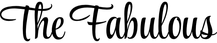
The primary logo is the script wordmark. Use the black+gold version on light backgrounds, the all-white version on dark backgrounds. SVG is preferred for screens; PNG for contexts that don't support SVG.
Do: Use SVG at any size. Maintain the aspect ratio. Give the logo breathing room — minimum clear space equal to the cap height of the "T".
Don't: Recolor, distort, add drop shadows, or place on busy backgrounds without sufficient contrast.
All colors are defined as CSS custom properties on :root in main.css. Use variable names in code — never raw hex values.
Four typefaces — each with a distinct role. All loaded from Google Fonts.
Spacing, radii, shadows, and layout constraints — all from :root in main.css.
| Variable | Value | Usage |
|---|---|---|
| --r | 6px | Default border radius — cards, buttons, inputs |
| --r-lg | 12px | Large radius — modal panels, featured cards |
| --shadow | 2-layer | Card elevation — subtle ambient + soft spread |
| --max | 1200px | Max content width |
| --gutter | clamp(1rem, 4vw, 2rem) | Horizontal page padding |
| --rule | rgba(26,20,16,.15) | Standard divider / border color |
| --rule-lt | rgba(26,20,16,.08) | Lighter divider for nested elements |
Core UI patterns. Use the class names from main.css — don't write custom one-off styles for these.